[N]on-line High street – Shang-Jen Victor Tung

Print

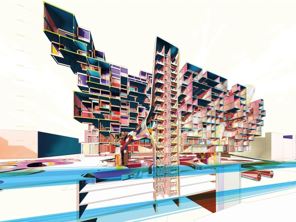
People are quicker to pull out a smartphone to check the time, then to look at their watch, and even quicker to go shopping on their phone then to go to a mall.  The shopping experience as we know today is rapidly disintegrating.  More people are making their purchases online and now they can do it from anywhere, no longer shopping from home.  The smartphone has allowed us to actually interact with our surrounding spaces.  Shang-Jen Victor Tung begins to look at changing the way in which we shape, organize and even stock for today’s modern shopper.  The architecture will no longer stand as a static strip mall, but will strive to connect with each customer thru digital means.  Check it out after the jump! 

STUDENT: Shang-Jen Victor Tung
SCHOOL: 
Royal College of Art
PROFESSORS: Roberto Bottazzi; Kostas Grigoriadis
YEAR: 2013

Continue reading

Above The River – Jean-Paul El Hachem

1 (8)

Today, we’re showing an F+ original, from Jean-Paul, at Holy Spirit University of Kaslik.  His design for a cultural center is based on the idea of stitching the chaotic urban environment of Dbayeh with the natural setting of Naher El Kaleb.  The design uses integrated green spaces to create a transition between the 2 areas, creating a flowing environment.  Check it out.

STUDENT: Jean-Paul El Hachem
SCHOOL:  
USEK – Holy Spirit University of Kaslik
PROFESSORS: Elie Haddad
YEAR: Fall 2012

Continue reading

Creating the World of “Oblivion” – Joe Kosinski

oblivion02

For years Futures+ has been checking out the work of Joe Kosinski, and after seeing their new behind the scene glimpse into “Oblivion” we had to share.  Besides it is Friday, the weather is amazing, and we all know you could use a nice studio break with some amazing inspiration!

FILM: Creating the World of “Oblivion” (2013)
DISIGNERS: Director Joe Kosinski,Lead Graphics animator David “dlew” Lewandowski, and Design Director Bradley “Gmunk” Munkowitz
YEAR: 2013

Continue reading

Amsterdam Workplace VI – Yaohua Wang

Image converted using ifftoany

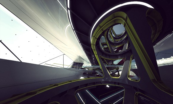
Last year we came across Yaohua Wang’s work done at SCI-Arc, and we are back to check a new project done at the Harvard GSD.  Yaohua Wang’s work takes a look at the world and culture of the changing and ever emerging VFX (visual effects) industry.  The design strives to bring filming and post production all under one house.  The circulation whips through the building trying to tie the spaces together with this flowing network of progression through the building.  The renderings and graphic diagrams done by Yaohua Wang are strong architectural visual effects within themselves.  Check it out after the jump!

STUDENT: Yaohua Wang
SCHOOL:
Harvard GSD
PROFESSORS: Ben Van Berkel & Imola Berczi
YEAR: 2013

Continue reading

Modular Housing – Thomas Khoueiry

Conceptual Mall Design 3

When we think of modular homes of late in the US it has been to create flexible and extremely compact homes for places like NYC.  Thomas Khoueiry’s approach in Lebanon was not only to design a modular housing development for Lebanon’s housing crisis, but to also to revitalize the abandoned quarries.  The quarries have left scares all over the landscape, and this new spanning housing typology tries to recapture these lands.  As the project isn’t heavily built into the landscape, but touching it at points, maybe the opportunity for the land to become revitalized over time is a possibility.  Check it out after the jump!

STUDENT: Thomas Khoueiry
SCHOOL: 
USEK – Holy Spirit University of Kaslik
PROFESSORS: Zafer Sleiman
YEAR: Fall 2012

Continue reading

Bundle House – Jason Orbe-Smith & Keyla Hernandez

kcvpa6u0tl34wdqg

Some architects live for straight lines and simple geometrical forms, and others are enticed by the elegance and seductiveness of a curve. Jason Orbe-Smith & Keyla Hernandez’s exploration into curvature with their Bundle House certainly would catch the eye of both sides of the conversation.  The language and detail of the curve is given strength and rigor through the exploration of digital scripting, where the spaces flow into each other and visual densities define private and public space through the fenestration.  Even the landscape and vegetation allows for the architecture to defining its own spatial relationship to the site.  Our only criticism is trying to call this a single family home, the programmatic strength and study could greater serve as a new possible network of urban sprawl.  Check it out after the jump!

STUDENT: Jason Orbe-Smith & Keyla Hernandez 
SCHOOL:
SCI-ARC
PROFESSORS: Hernan Diaz Alonso
COURSE: XLAB studio
YEAR: 2012

Continue reading

Library Extension – Natalie Kwee

library_axoncut_800

Everybody gets the sense of being totally overwhelmed either when trying to gather information for a test, the sheer magnitude of a project, or even walking into the library and the overpowering amount of information at your finger tips.  At first glance, when we got Natalie Kwee submission, that same sense of being overwhelmed hit me as I tried to figure out the architectural organization and spatial movements in the design.  My eyes were forced to constantly move through and look at the all spaces and diagrams.  That exact emotion is what Natalie was going for in her Library expansion design, by creating this intense maze of space to move through in your quest for knowledge.  Yet at the same time the design encompasses how we internally deal with being overwhelmed, by breaking the task down into smaller compartmental pieces.  Check it out after the jump!

STUDENT: Natalie Kwee
SCHOOL: 
Cornell University
PROFESSORS: Val Warke
AWARD: 2012 AIANYS Student Award Winner
YEAR: Spring 2011

Continue reading

Borgh dël Fum Projects – Simone Callea

Gradenigo Hospital

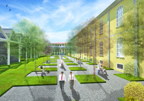
Simone Callea thesis is an attempt at bringing a mixed use program to renew the “Borgh dël Fum Projects” in Turin.  Turin is a city that has been left with vast complexes from the 2006 Winter Olympics to the old FIAT Factory, and pushing to modernize and revitalize parts of the city.  While studying at the Polytechnic University of Turin myself, we played with designing the new train station based on the master plan by Arch. Massimiliano Fuksas. Simone project pushes the live, play, and work model into large spanning urban renewal plan and integrating sustainable design.  The programs are not clearly defined as public and private spaces blend together creating smaller neighborhoods within the structure.  Check it out after the jump!

STUDENT: Simone Callea
SCHOOL: 
Polytecnhnic University of Turin
PROFESSOR: Paolo Mellano and Alessandro Fubini
COURSE:  Thesis / Floornature International Architecture Contest

Continue reading

Digital Form+Structure – Levente Gyulai

14

Most professors are probably standing over your shoulder hounding you to show them your sketches and ideas; they don’t want to watch your intangible 3D model orbit around on your screen.  They want to bleed red ink all of your sketches, break apart and reshape your models, and possibly click on your screening and dealt all the work you did the past 3 hours.  Yet you sketchbook doesn’t need to all be by hand, we must be as willing and nimble with the digital tools at our disposal.  We got a peak into Levente Gyulai digital sketch book into today’s post, where his ideas are quickly generate, not in there pristine form, and rendered, photoshopped, and manipulated into an architecturally rich conversational piece. As students you must learn to produce quickly, and understand your drawings, models, and renderings are better left dirty then in there perfect form.  Enjoy the work of Levente Gyulai after the jump!

STUDENT: Levente Gyulai
SCHOOL: Szent István University –  SZIE-YBL Miklos Architecture Faculty
YEAR: 2013

Continue reading

Stockholm Library Interior – Olivier Charles, Armel Neouze, Jacques Gelez

You think you have rendered enough when you click and wait 2 hours for one image?  Try doing that 1,000 times over and over again until you have the perfect image like Olivier Charles, Armel Neouze, Jacques Gelez did for their ‘Wall of Knowledge’ design.  We know its a few years back but this amazing tutorial gives you a glimpse into the painstaking detail that goes into an image like this.  We highly suggest taking a studio break and following the link to the design tutorial!

STUDENT: Olivier Charles,  Armel Neouze, Jacques Gelez
SCHOOL: 
Architecture School of Paris La Seine
COURSE: International Competition of Architecture
YEAR: 2009

Continue reading