NIGHTVISION – LUKE SHEPARD

NIGHTVISION _ LS

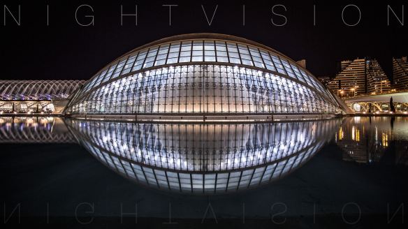
Last year F+ came across Luke Shepards Kickstarter quest to make a feature length film of his architectural time lapses.  With his original success from his first architectural night documentary he set out to capture the beauty of some the best architectural destinations in Europe. Now after 21 countries, 36 cities, 28 buildings and a couple thousand photos later we get to see Luke’s finale creation of NIGHTVISION.  Check it out after the jump!

STUDENT: Luke Shepard – www.lshep.com 
SCHOOL: 
American University of Paris
YEAR: 2013

Continue reading

Dystopia – Eli Keller

250- 2

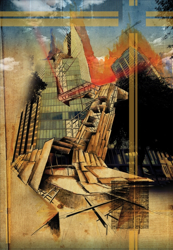
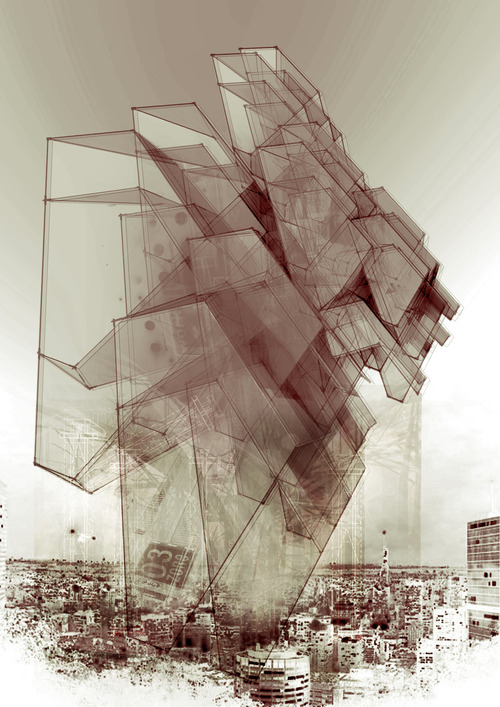
What if the cities we are designing today are not actually the futuristic utopias for the modern word, but rather the fragile materialistic fridges of our future dystopias? Today we are showcasing Eli Keller’s graphically stunning architectural exploration through collage into the creation of a Dystopia.  Eli Keller sees Tel Aviv as the perfect storm where this lively urban culture is slowly losing its own identity; a victim of the modern world.  You can see this in modern throughout the world, where the buildings and cities we live in have lost their sense of place.  The glass screens on our phones and the glitter of modern buildings have forced us into a blasé attitude towards the world, blinding us to the loss of our cultural identities. Check it out after the jump!

STUDENT: Eli Keller
SCHOOL: 
Ariel University School of Architecture
PROFESSORS: Beni. R. Levy, Itzhak El-Hadif, Dana Oberson,
Yehuda Mendelson, Sa’adia Mandel
COURSE: 5th Year – BA
YEAR: 2013

Continue reading

Futures + Design – Your Student Architectural Journal!

Spring break is over for most, and instead of putting hours into studio it is days, as all you push your designs to the limits for final studio critiques.  From first years to thesis grads we know what it takes, we have been asleep under our desk, in the same clothes for days, and had piles of coffee cups on our desk.  That is why we started F+ so that when it is all said and done, you can showcase all that hard work to the world!

Continue reading

Futures + Design – Your Student Architectural Journal!

F+ was started to showcase all the best designs coming out of the academic design realm across the map and to provide a platform to bring them to light.  The semester has just kicked off for most, and others you are already pulling all nighters, but don’t let that hold you back from submitting your to be showcased.  We look forward to seeing your projects submitted!

Continue reading

NEAR UNISON – Dan Dodds

near-unison-01

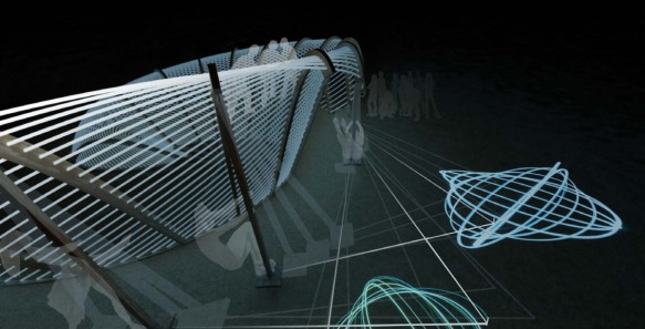
We always look forward to seeing what comes out Studio 10 at the Westminster University School of Architecture and the Built Environment.  Dan Dodds Near Unison is an exploitative and playful design pavilion for the Burningman Festival, an extreme gathering of people in Nevada’s Black Rock Dessert to celebrate art, self-expression, and community.  Burningman’s crowds are an eccentric group, but this pavilion fits right in, as the pavilion acts not only as a destination point, resting area, but is also a gigantic pendulum to create sand art.  Check it out after the jump!

STUDENT: Dan Dodds 
SCHOOL:
 Westminster University School of Architecture and the Built Environment
PROFESSORS: Arthur Mamou-Mani and Toby Burgess
COURSE: Studio 10 – wewanttolearn.wordpress.com
YEAR: 2013

Continue reading

Digital Form+Structure – Levente Gyulai

14

Most professors are probably standing over your shoulder hounding you to show them your sketches and ideas; they don’t want to watch your intangible 3D model orbit around on your screen.  They want to bleed red ink all of your sketches, break apart and reshape your models, and possibly click on your screening and dealt all the work you did the past 3 hours.  Yet you sketchbook doesn’t need to all be by hand, we must be as willing and nimble with the digital tools at our disposal.  We got a peak into Levente Gyulai digital sketch book into today’s post, where his ideas are quickly generate, not in there pristine form, and rendered, photoshopped, and manipulated into an architecturally rich conversational piece. As students you must learn to produce quickly, and understand your drawings, models, and renderings are better left dirty then in there perfect form.  Enjoy the work of Levente Gyulai after the jump!

STUDENT: Levente Gyulai
SCHOOL: Szent István University –  SZIE-YBL Miklos Architecture Faculty
YEAR: 2013

Continue reading

Party Wall – CODA – MOMA PS1

partywall_111

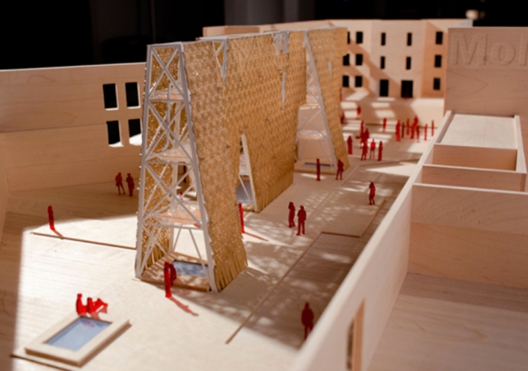
Today we are stepping away from the realm for academic architecture, to take a look at an up and coming young architecture design studio, CODA, who recently was selected the annual MOMA PS1 winner.  Young Architects Program at MoMA and MoMA PS1 is committed to offering emerging architectural talent the opportunity to design and present innovative projects, challenging each year’s winners to develop creative designs for a temporary, outdoor installation at MoMA PS1.  CODA’s “Party Wall” sustainable and recycling approach re-uses skateboard bi products to create large shading screen within the PS1 site.  F+ is looking forward to checking it out this summer, but you can check out more after the jump!

DESIGN STUDIO: CODA
COMPETITION:
MOMA PS1 – Young Architects Program
YEAR: 2013

Continue reading

Posted in Competittion | Tagged , , competition, , design studio, MOMA, new york city, , PS1, recycle, research, skateboards, sustainable, young architects | Leave a reply

AIR-CHITECTURE TOWER – Intelligent Pencil

tumblr_md4d5jBMNm1rxkpsn

We only know this student by pen name, Intelligent Pencil, but once you look at his work you will understand why, and you won’t be able to look away.  We get a glimpse into the different exploration and research needed that builds to these works.  The project builds from a quick study of power lines creating structure, the Birk+Heilmeyer 2010 Observation Tower in Scholzberg, Czech Republic, and an inverse hyperboloid study.  The geometric forms layered create an intensified field condition leaving a rich architectural statement.  Check it out after the jump!

STUDENT: SCHOOL:
YEAR: 2012

Continue reading

Thin, Flat, and Super-Inflatable – Diana Barash, Mary Rose Parker, Julius Taniguchi,& Rebecca Fox

02_Parker

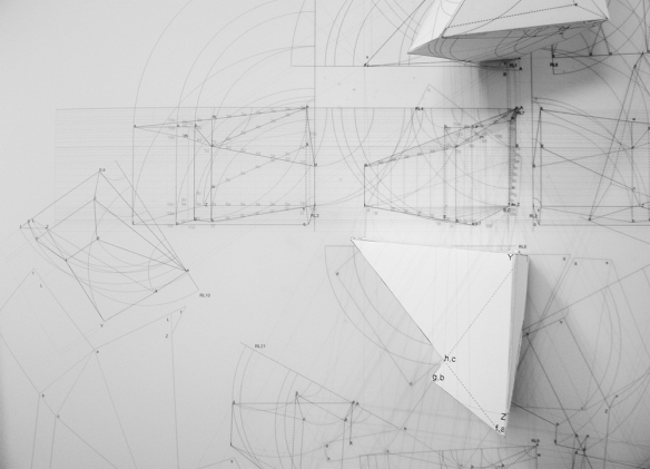
Some fear that the art of drawing and design in architecture is fading, and in the professional world it certainly is, however the ability to visualize your ideas threw drawing is still held close to the chest in academic architecture.  I can’t tell how many times my professors asked where my sketch book was, or told me to get out of the computer and back to the trace.  Mark Ericson introduction to architectural drawing is in depth and imaginative view into explorative 2D and 3D architectural drawing.   The work pushes the importance of line weight, shadow control, and pulling 2 D into the 3D realm.  Check it out after the jump!

STUDENT: Diana Barash, Mary Rose Parker,
Julius Taniguchi,& Rebecca Fox
SCHOOL: 
Woodbury University
PROFESSORS: Mark Ericson
COURSE:  Intro. to Architectural Drawing
YEAR: 2013

Continue reading