Water Tower – Aman Yusuf

IMG_6871

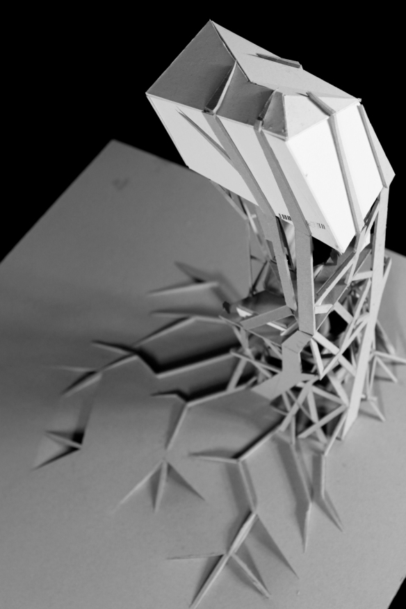
Under Professor Ginger Krieg Dosier, an up and coming architect/scientist, Aman Yusuf designed his water tower to become a focal point in the neighborhood of Jumeriah.  It not only acts as water source, but meeting area with its tea bar and over looking observation deck.  Its program is simple, but the model itself is what sparked our interest.  Pulling from the network of veins within the leaf, the structure of the model seems to grow out of the ground wrapping the building and pushing the tower up.  Check it out after the jump! 

STUDENT: Aman Yusuf
SCHOOL: 
American University of Sharjah
PROFESSORS: Ginger Krieg Dosier
YEAR: 2011

Continue reading

DraWearing – Accademia di Belle Arti di Bologna

DS1_FRONT-copy

With digital fabrication becoming so prevalent within the design and architectural realm we are seeing more and more students bridging the gap between design disciplines.  Fashion and architecture have always danced the line into each other as architecture creates space, but fashion inhabits space.  Niccolo Casas students crossed the boundaries of traditional design and explored the relationship between the body and a 3D artifact.  Coco Channel said it best as “fashion is architecture: it is a matter of proportions.”  Check it out after the jump!

STUDENT: Federica Sangiorgi, Lorena D’Alfonso,
Carlotta Bandiera, Ella Saidi, Elena Setnikar
SCHOOL: 
Accademia di Belle Arti di Bologna
PROFESSOR:  Niccolò Casas 
COURSE: Digital Modeling Techniques
YEAR: 2011

Continue reading

Futures + Design – Your Student Architectural Journal!

F+ was started to showcase all the best designs coming out of the academic design realm across the map and to provide a platform to bring them to light.  The semester has just kicked off for most, and others you are already pulling all nighters, but don’t let that hold you back from submitting your to be showcased.  We look forward to seeing your projects submitted!

Continue reading

NEAR UNISON – Dan Dodds

near-unison-01

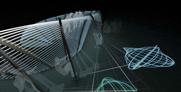
We always look forward to seeing what comes out Studio 10 at the Westminster University School of Architecture and the Built Environment.  Dan Dodds Near Unison is an exploitative and playful design pavilion for the Burningman Festival, an extreme gathering of people in Nevada’s Black Rock Dessert to celebrate art, self-expression, and community.  Burningman’s crowds are an eccentric group, but this pavilion fits right in, as the pavilion acts not only as a destination point, resting area, but is also a gigantic pendulum to create sand art.  Check it out after the jump!

STUDENT: Dan Dodds 
SCHOOL:
 Westminster University School of Architecture and the Built Environment
PROFESSORS: Arthur Mamou-Mani and Toby Burgess
COURSE: Studio 10 – wewanttolearn.wordpress.com
YEAR: 2013

Continue reading

The Treehouse at Yale – Griffin Collier

7aec6dc2148b29959bac01734b3ede0b_large

The first home you design, build, and live in is most likely that dangerous tree house hanging out behind your parent’s home.  I mean who didn’t dream about a building a sweet tree house as a kid in the summer?  They capture your childhood imagination, scare your mom, and give you epic scares when you fall out of them.  Just something about being a midst the tree line seems to capture our imagination.  Griffin Collier seemed to have never lost that fascination with the tree line, as he has set out this year to build a permanent tree house on Yale’s campus.  After a year and a half of design and a successful crowd source on Kickstarter, Yale might finally have as sweet a tree house as the one in Stepbrothers!  Check it out after the jump!

STUDENT: Griffin Collier 
SCHOOL: Yale School of Architecture
YEAR: 2013

Continue reading

Posted in Yale School of Architecture | Tagged , architecture student, , nature, Tree House, Yale | Leave a reply

Digital Form+Structure – Levente Gyulai

14

Most professors are probably standing over your shoulder hounding you to show them your sketches and ideas; they don’t want to watch your intangible 3D model orbit around on your screen.  They want to bleed red ink all of your sketches, break apart and reshape your models, and possibly click on your screening and dealt all the work you did the past 3 hours.  Yet you sketchbook doesn’t need to all be by hand, we must be as willing and nimble with the digital tools at our disposal.  We got a peak into Levente Gyulai digital sketch book into today’s post, where his ideas are quickly generate, not in there pristine form, and rendered, photoshopped, and manipulated into an architecturally rich conversational piece. As students you must learn to produce quickly, and understand your drawings, models, and renderings are better left dirty then in there perfect form.  Enjoy the work of Levente Gyulai after the jump!

STUDENT: Levente Gyulai
SCHOOL: Szent István University –  SZIE-YBL Miklos Architecture Faculty
YEAR: 2013

Continue reading

Party Wall – CODA – MOMA PS1

partywall_111

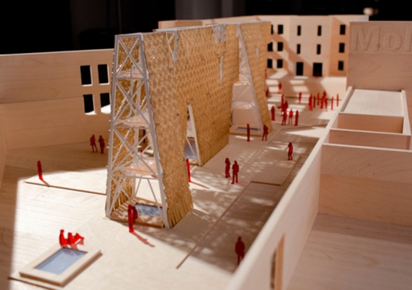
Today we are stepping away from the realm for academic architecture, to take a look at an up and coming young architecture design studio, CODA, who recently was selected the annual MOMA PS1 winner.  Young Architects Program at MoMA and MoMA PS1 is committed to offering emerging architectural talent the opportunity to design and present innovative projects, challenging each year’s winners to develop creative designs for a temporary, outdoor installation at MoMA PS1.  CODA’s “Party Wall” sustainable and recycling approach re-uses skateboard bi products to create large shading screen within the PS1 site.  F+ is looking forward to checking it out this summer, but you can check out more after the jump!

DESIGN STUDIO: CODA
COMPETITION:
MOMA PS1 – Young Architects Program
YEAR: 2013

Continue reading

Posted in Competittion | Tagged , , competition, , design studio, MOMA, new york city, , PS1, recycle, research, skateboards, sustainable, young architects | Leave a reply

Dodecahedronic Chair – Hiroaki Suzuki

dodecahedronic01

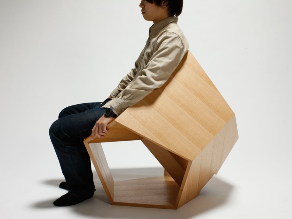
Today we are changing it up and checking out Hiroaki Suzuki’s chair design derived from his research into geometric form in product design. Furniture design requires immense study into form and function, in this design each piece is carrying and dispersing the weight throughout the structure.  The designs geometric form gives both structural and aesthetic integrity.  Check it out after the jump! 

STUDENT: Hiroaki Suzuki
YEAR: 2012

Continue reading

AIR-CHITECTURE TOWER – Intelligent Pencil

tumblr_md4d5jBMNm1rxkpsn

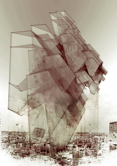
We only know this student by pen name, Intelligent Pencil, but once you look at his work you will understand why, and you won’t be able to look away.  We get a glimpse into the different exploration and research needed that builds to these works.  The project builds from a quick study of power lines creating structure, the Birk+Heilmeyer 2010 Observation Tower in Scholzberg, Czech Republic, and an inverse hyperboloid study.  The geometric forms layered create an intensified field condition leaving a rich architectural statement.  Check it out after the jump!

STUDENT: SCHOOL:
YEAR: 2012

Continue reading

Art Grounds of Pyrmont- Callum Andrews

drawing copy

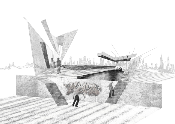
Check out this project from Callum Andrews, at the University of Technology in Sydney.  Placing as much emphasis on the movement through the building, as well as the creation spaces, the building strikes a dynamic balance between the act of making and the act of seeing. Check it out!

Student: Callum Andrews
School: University of Technology, Sydney 
Professors:
 Joanne Kinniburgh
Course: Second Year Studio
YEAR: 2012

Continue reading