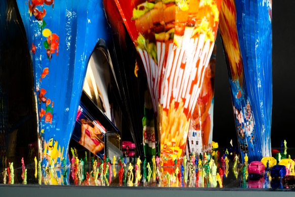
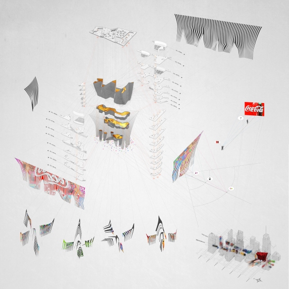
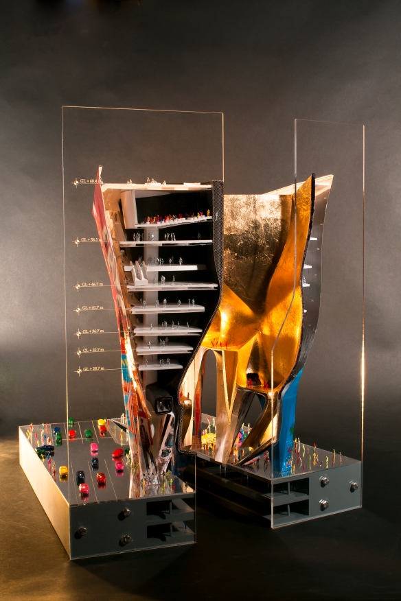
Times Square in NYC is one of the most overly-saturated commercial spaces in the world. Every surface is covered in billboards. Toshiki Hirano used that as a driving mechanism in his design for a new Times Square, creating a building that’s first need is area for advertising. Although a constant flickering billboard at street level might not be the most intriguing in terms of a civic space, it certainly creates a new face for Times Square. Check out the rest of the project.
STUDENT: Toshiki Hirano
SCHOOL: Princeton SoA
PROFESSORS: Elizabeth Diller, Michael Meredith
CLASS: Thesis
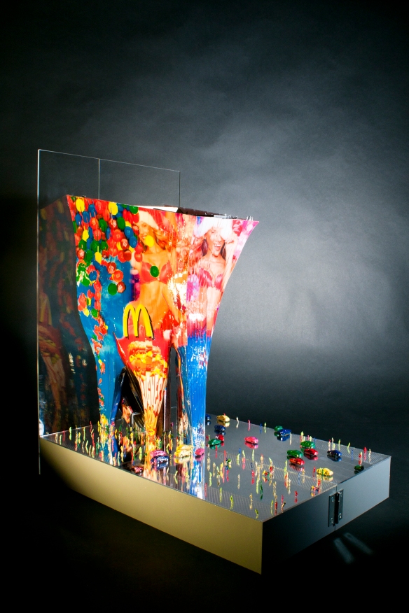
“In the world of capitalism, buildings’ values are determined on how much inhabitable space they have—which is to say, Total floor Area. Based on this logic, slab has been put in higher hierarchy among other elements in architecture since modernism, and a notion of stacking floor slabs has been the smartest technology of increasing the building value for maximizing the total floor area while minimizing the amount of structures and envelope area.
However, there is a place where this logic becomes dumb, even the place itself is driven by capitalism: Times Square. Here, a value of building envelope as a site for billboards exceeds a value of floor. The average rate of billboard space in Times Square is almost three times more expensive than the average rate of office space in Manhattan. Thus this project challenges this hierarchy by taking a closer look at the surface property of architecture.
We cannot talk about the relationship between architecture and billboards without mentioning Robert Venturi and Scott Brown. Their notion of “decorated shed” is clearly shown in their proposal for Times Square Information Center, which could be perceived as a big apple as a billboard on top of a banal box-shaped building. They have criticized “duck” by architecture being a dictator over other disciplines, however, this project criticizes “decorated shed” by architecture being too autonomous or indifferent about other disciplines. Here, I want to propose in-between condition of duck and decorated shed, something in which billboard and architecture being semi-autonomous and create an effect as a whole.
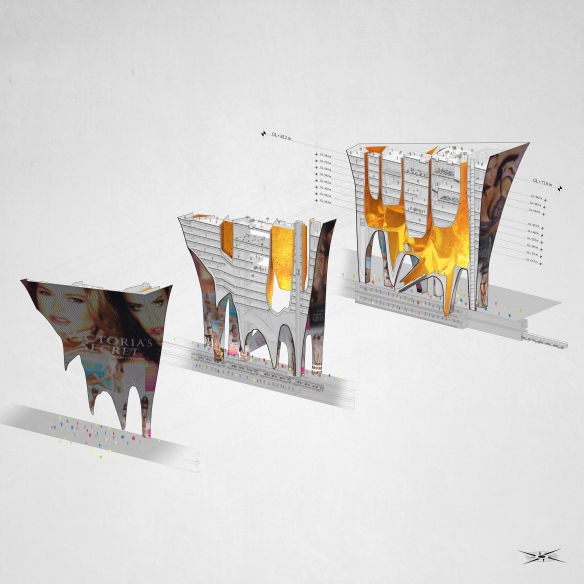
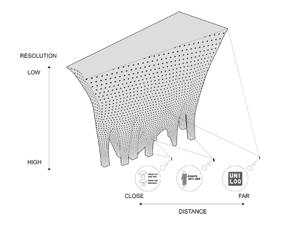
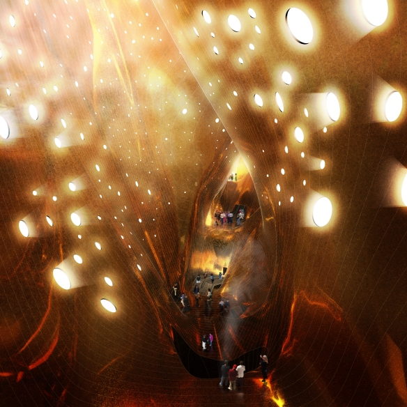
The basic strategy of this project is subdividing a building mass into numbers of smaller volumes to increase the surface area for advertisements. Since there’s a need for space to enable people to locate themselves to see advertisements, tapering each volume is introduced to make the ground level as an extended street level, thus people can walk in and see the advertisements inside. LED pixels cover the entire envelope. Size and density of the pixels change according to different viewing distances: lower density pixels with larger projection area on the upper level where viewing distance is relatively long, and higher resolution with smaller projection area on the lower level where distance between person and surface gets shorter. Whereas a conventional billboard only functions with a certain viewing distance and it only conveys single information, this system works with multiple viewpoints and people will acquire different information depending on the distance from the surface. Each leg houses vertical circulation system that leads to upper level where the inner skin is pushed out and the floor plates get bigger to house program such as movie theaters. The space inside the inner skin is totally opposite in its attribute from the outer skin on which information is thoroughly com-modified Noises and steam will come out from some of the legs that reach to subway station underneath, each aperture on the skin will convey the sense of activity inside, and the sunlight comes through the slit.”
– Toshiki Hirano
Well worth checking out the rest of Toshiki Hirano work at : toshiki-hirano.com
All Images and Text via:
toshiki-hirano.com
http://www.suckerpunchdaily.com/2013/01/02/times-square-re-imagined/

