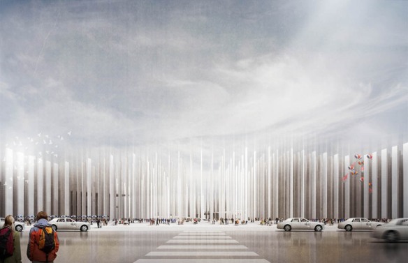
F+ is kicking off the week with Light Monumentality by Glen Santayana from our backyard at the Harvard GSD. The project is a play on visual transparency through the organization of a field condition to create enclosure and openness. The transparency achieved through this field of columns is understood at varying levels in relation to place. Check it out after the jump!
SCHOOL: Harvard University Graduate School of Design (GSD)
STUDENT: Glen J. Santayana
CRITICS: John Hong + Jinhee Park
YEAR: 2011
“The new Seoul international train station addresses the studio’s theme of ‘light monumentality’ through its monumental ‘classical’ entry sequence and overall size. While at the same time carrying a quality of lightness in the overall structural make-up and programmatic visual perception and deception.
The station is made up of 2,549 0.5m x 2m rectangular columns arrayed in a gridded pattern with each column specifically rotated to accommodate a programmatic, visual, or circulatory need. The rotation of each column creates a sense of enclosure by limiting and opening views, through which space becomes inherent in its macro organization.
The columns and program respond to each other in the sense that the rotation of the column determines program and vice-versa. Urbanistically, the field of columns facilitate urban porosity and continuity through the site by allowing public passage at the main ground level with more private programs floating within the columns.”
-Glen Santayana
All Images and Text from www.suckerpunchdaily.com and


It’s very nice but the images could be a bit misleading: Will the columns be blurry at the top? Have you done a physical model or full scale prototype? Might be nice to try and achieve this effect.